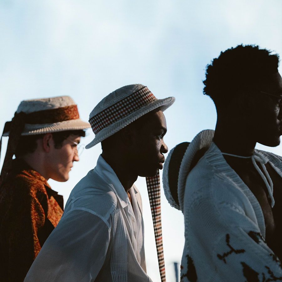
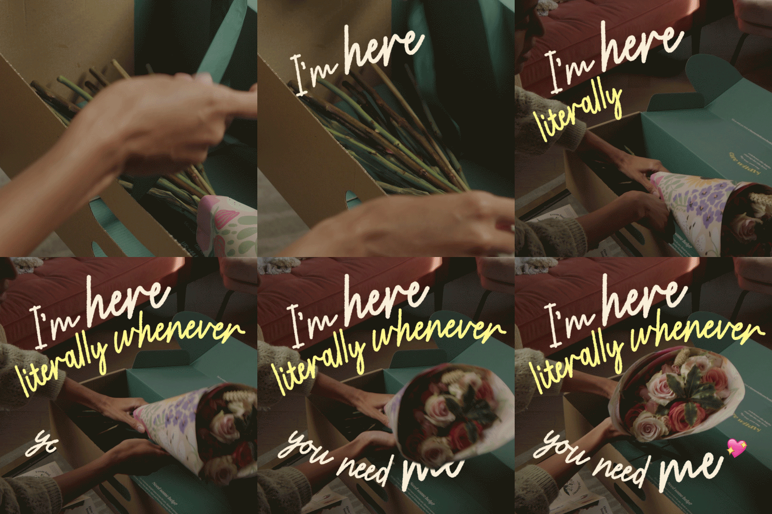
I worked closely with global design studio Checkland Kindleysides to build out a case study for their brand design work on the inclusive action sports brand Roxy. Checkland Kindleysides had already worked with Roxy to bring the new LOVE collection to life with its very own creative visual identity design and suite of product branding design assets. My task was to bring these assets to life and find a motion language in line with the design grammar already established.
Agency: Checkland Kindleysides
Client: Roxy
The bold letterforms of the Roxy LOVE logotype are hand cut and magnetised together, reflecting the Roxy brands values of togetherness and body inclusivity. The motion design needed to bring to life a playful, carefree yet purposeful brand expression. I did this by focusing on the elasticity and flexibility of the forms - developing a “squish” device that could be iterated across the various assets including tone of voice and UX.


